Interior designer Christina Nielsen brought a spot of English flair to Brooklyn recently when she set up her Clinton Hill-based design practice, Christina Nielsen Design. By that she means “Everything very intentionally put together, with lots of layers and patterns,” as in the decor of the duplex apartment she shares with her husband. “I love making rooms feel welcoming, warm, and like they’ve been there forever.”
Nielsen, who is originally from Connecticut, grew up spending every summer in England, where her father’s family lives, and spent time in London herself as an adult, studying contemporary art after pivoting from editorial work at Vogue magazine. All that influenced her design aesthetic. England is also where she received her first design commission: a private box at Ascot race course. “From there, I had a lot of inquiries and it just boomeranged.”
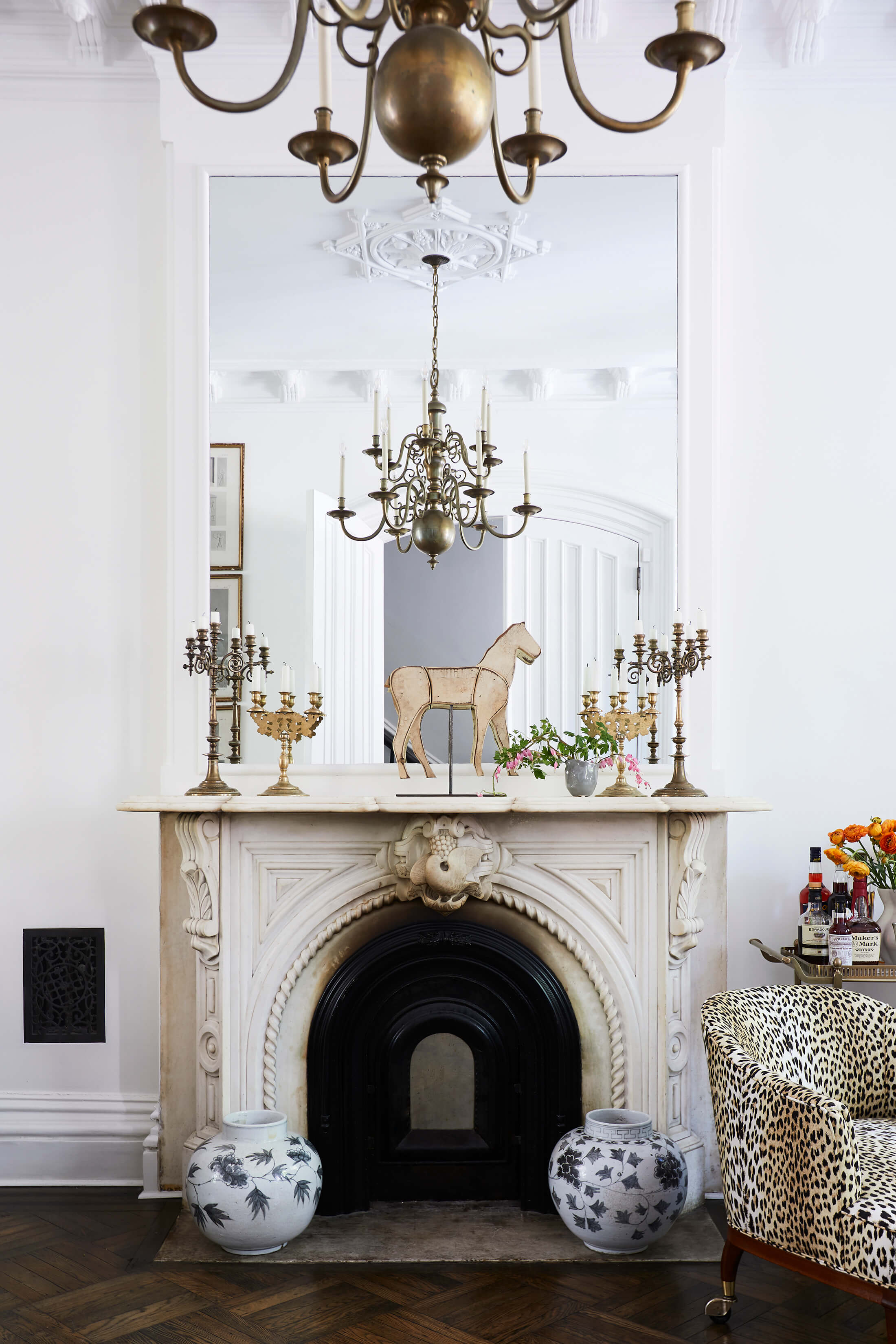
Amazingly, the meticulously renovated space on the two lower floors of a vintage brownstone, with fine plasterwork, arched doors and marble mantels, is a rental. The couple looked for more than six months to find it. The homeowners had bought the house about a decade earlier and “fully restored it,” Nielsen said. “I was very lucky to love what they did.”
Explore The Insider
Find your Brooklyn design inspiration
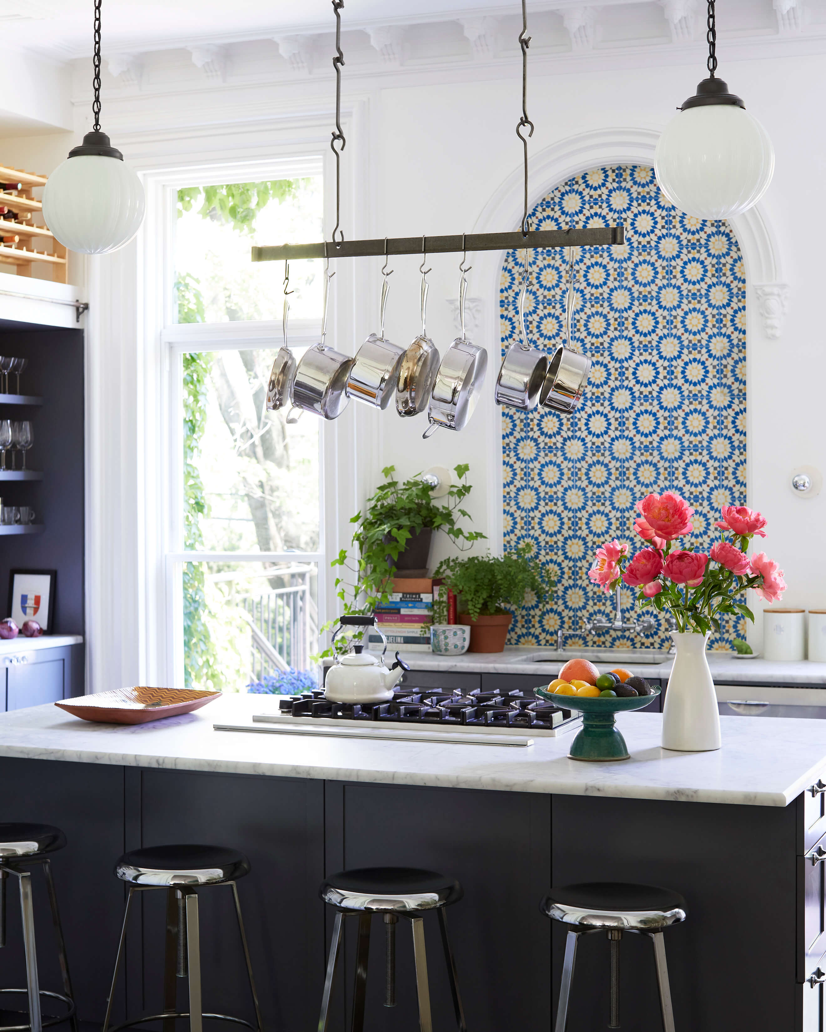
Nielsen did little to change the envelope, besides painting some walls on the lower level and putting her stamp in the kitchen with Moroccan tiles in an arched alcove over the sink.
But she went all in on furnishing the space from scratch, mixing antique and contemporary pieces with ease. “I have hints of maximalism, as you can see from all the patterns, and I use a lot of jewel tones. I love English antiques and Moroccan influences, especially in the details. And I love postwar art, so that brings out a more contemporary feel. I don’t want interiors to feel stuffy with heavy antiques.”
Nielsen is not an online shopper; she sourced everything in person, mostly from antique stores in upstate New York and Connecticut. Creativity with textiles is one of her calling cards. She personalized sofas and chairs by having them reupholstered in fresh fabrics, and did a bit of DIY, creating a skirted table in the kitchen and disguising a Murphy bed in the downstairs guest room with a hanging tapestry.
Everything was done with an eye toward flexibility. “Because this is a rental and I’m not going to be here forever, ” Nielsen said, “it’s really important that things can be repurposed down the line.”
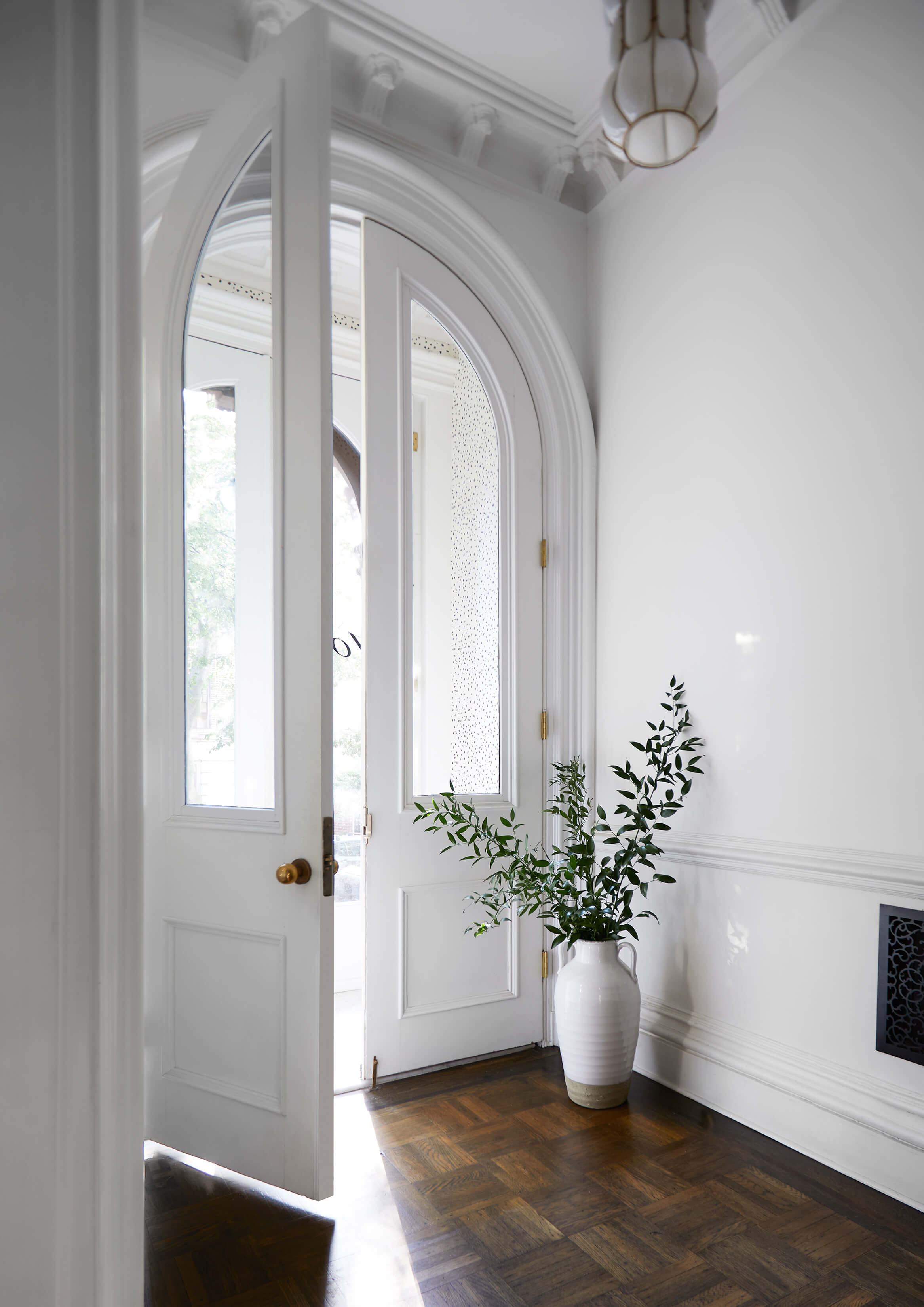
Original doors and moldings, pristine white walls and dark wood floors all made for a highly desirable rental. There were many applicants, but the homeowners deemed Nielsen and her husband the best fit.
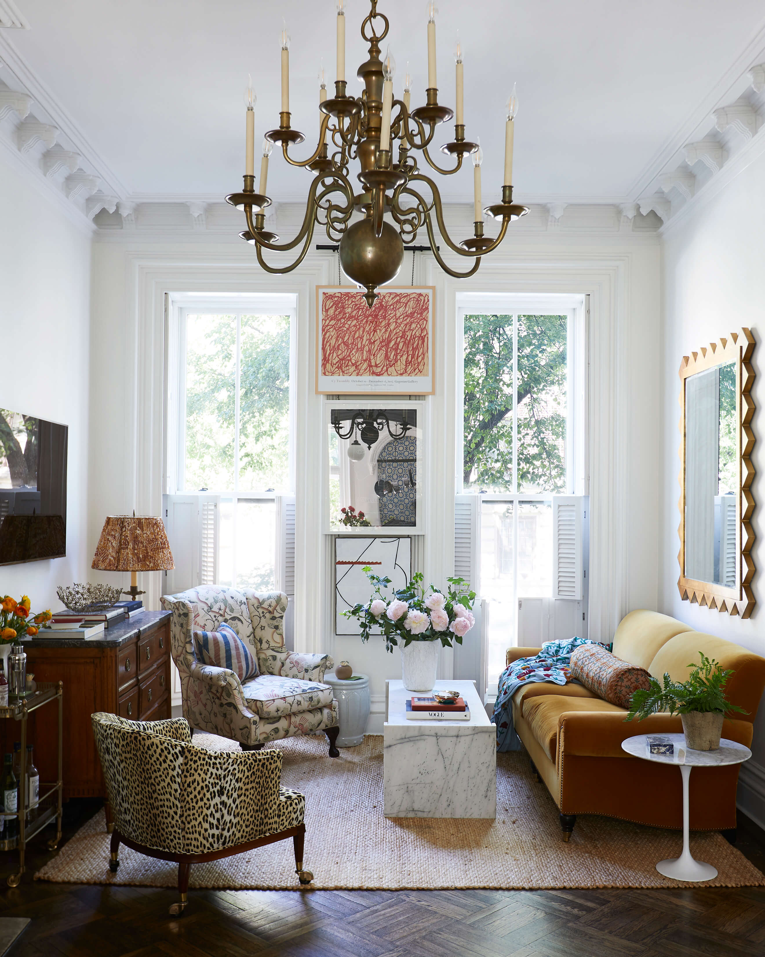
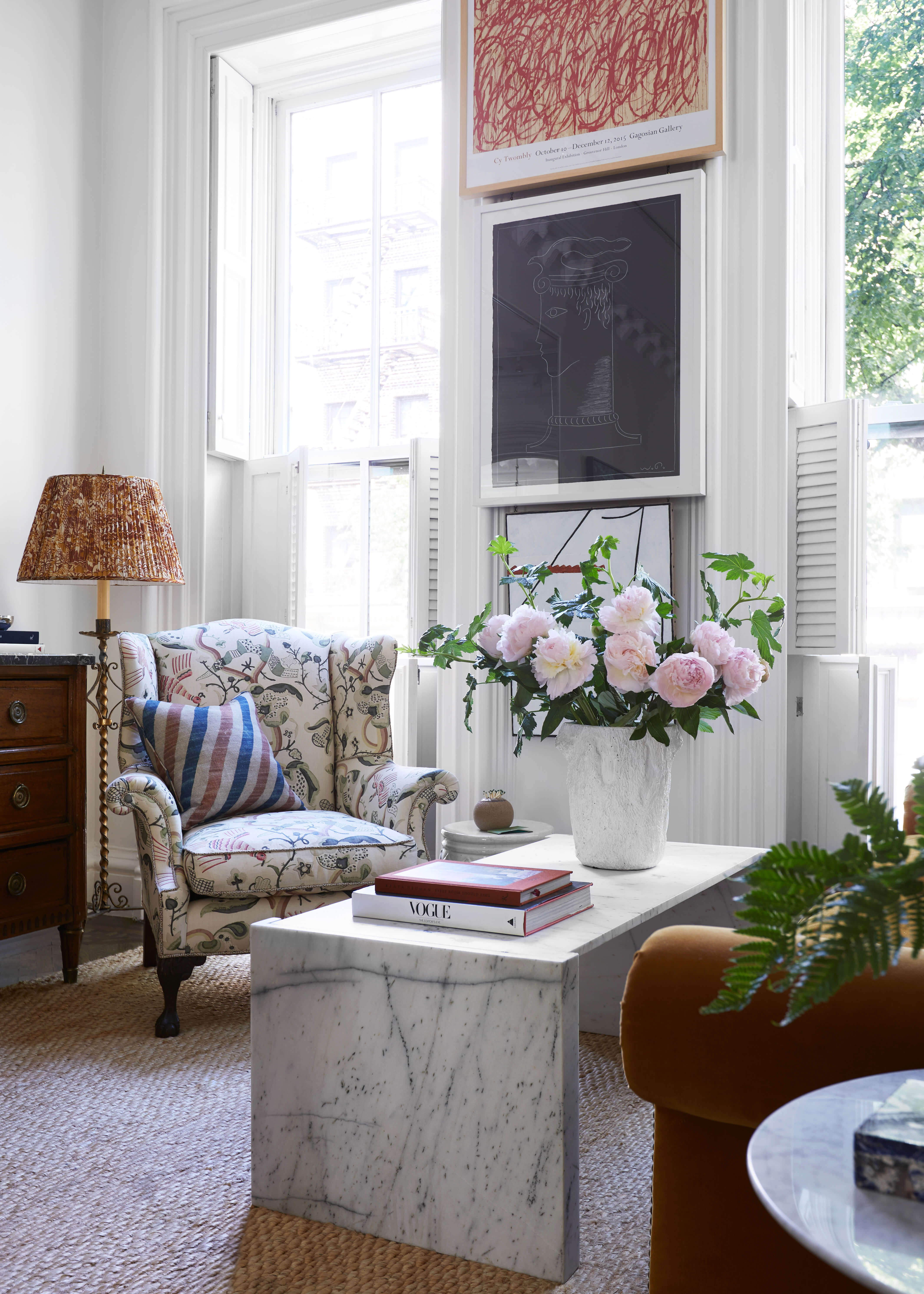
A mustard velvet sofa, antique armchairs, modernist coffee and side tables, and a sisal rug in the front parlor/living room are typical of the way Nielsen likes to mix things up.
The barrel-back chair is from RT Facts in Kent, Conn., with cheetah print fabric from Pierre Frey. The wing chair came from an estate sale; Nielsen recovered it in Claremont fabric.
Oversized mirrors bring more light into a space that, Nielsen said, “is super bright in the morning, then leaves you in the afternoon.”
Nielsen propped a massive mirror on the fireplace mantel, in scale with the high ceilings. “There’s nothing worse than a mirror too small for the space,” she said.
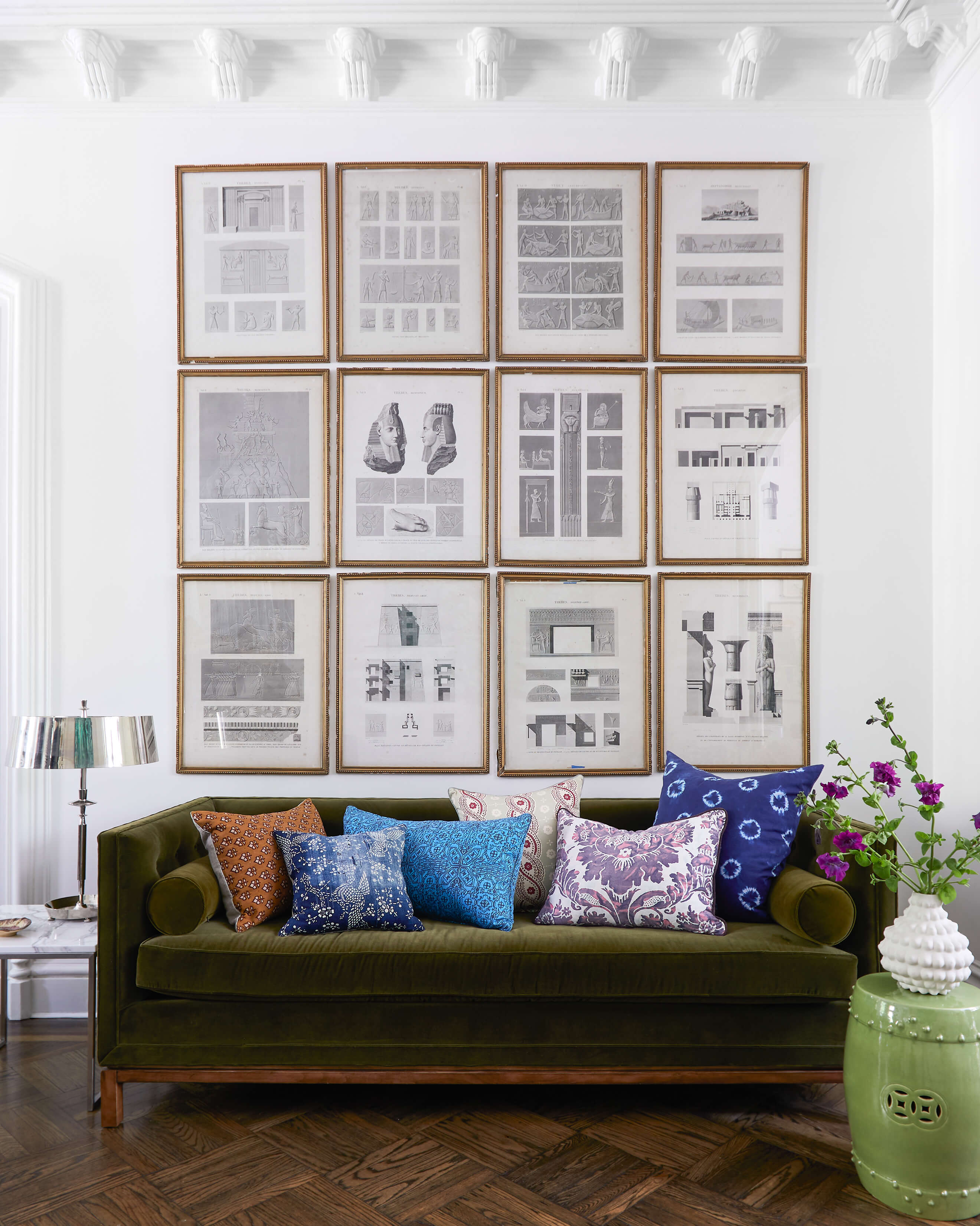
Nielsen revamped a dated Jonathan Adler sofa in the middle parlor/dining room, replacing gray fabric with moss green velvet and stripping white paint off the legs, and pulled in a load of color with vivid throw pillows.
A wall-spanning grid of framed architectural drawings has much more impact than two or three would.
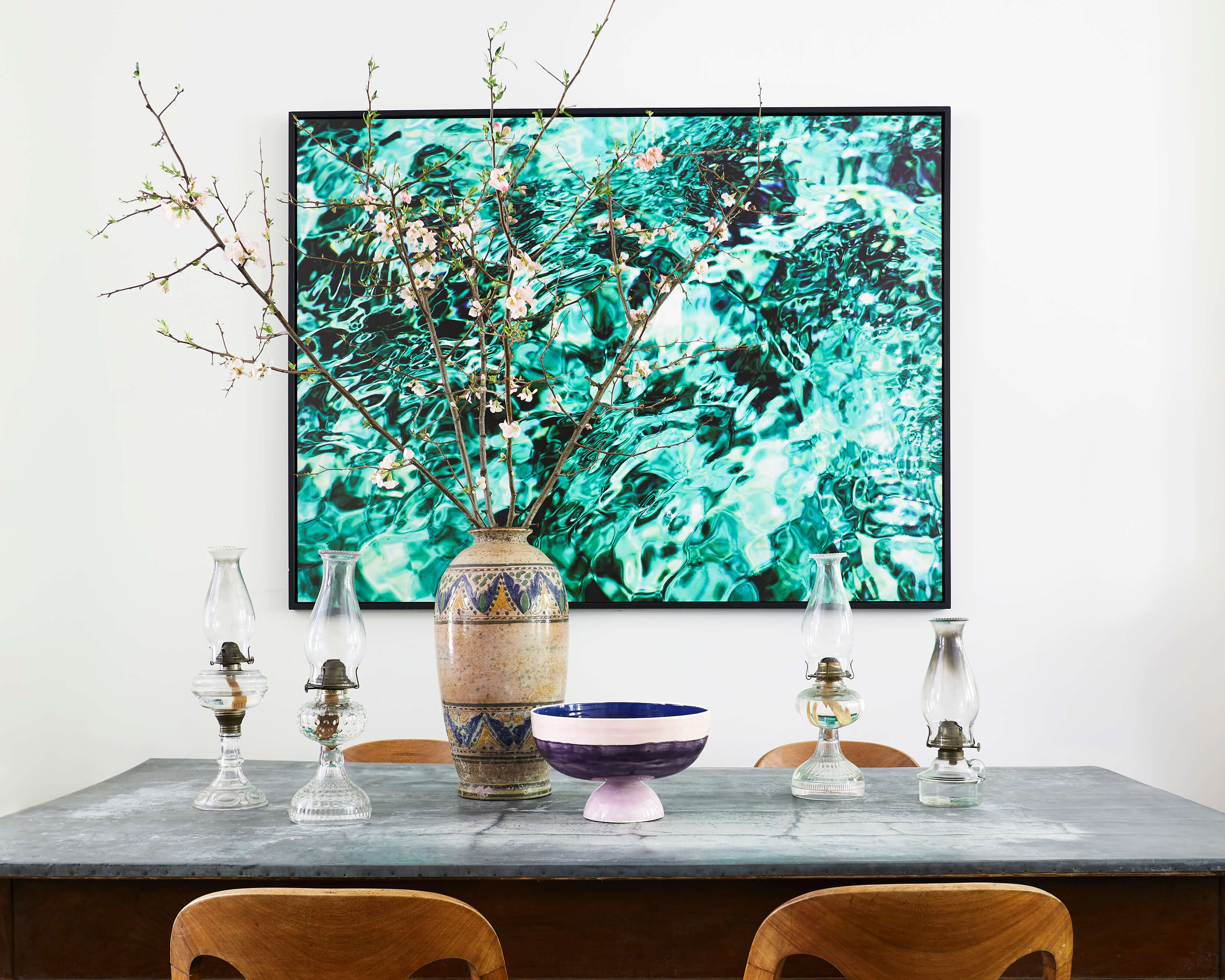
A new zinc top gives an antique wood table with turned legs a contemporary industrial feel.
Nielsen gave the vintage wood chairs new teal leather cushions to play off the artwork on the wall, an abstracted photograph of ocean waves.
The existing deep-gray kitchen cabinetry was very much to Nielsen’s liking. She added bright Moroccan tiles in an arched backsplash above the sink and aluminum stools for a modern feel.
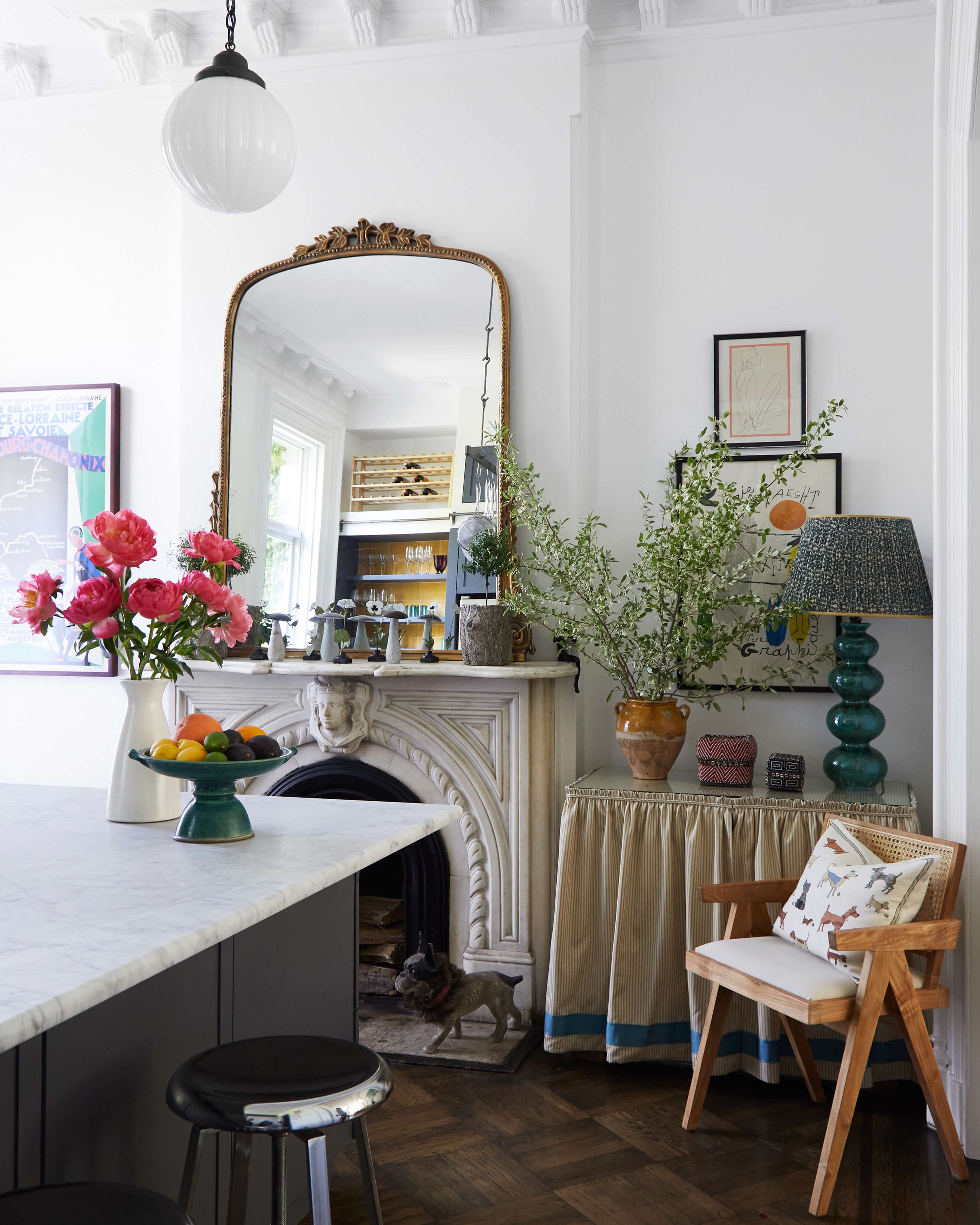
In a corner of the kitchen, Nielsen built a wooden table base (“super easy”) and attached skirting with Velcro. It splits in the middle to reveal a wine fridge and microwave. “I think those are such eyesores,” the designer said.
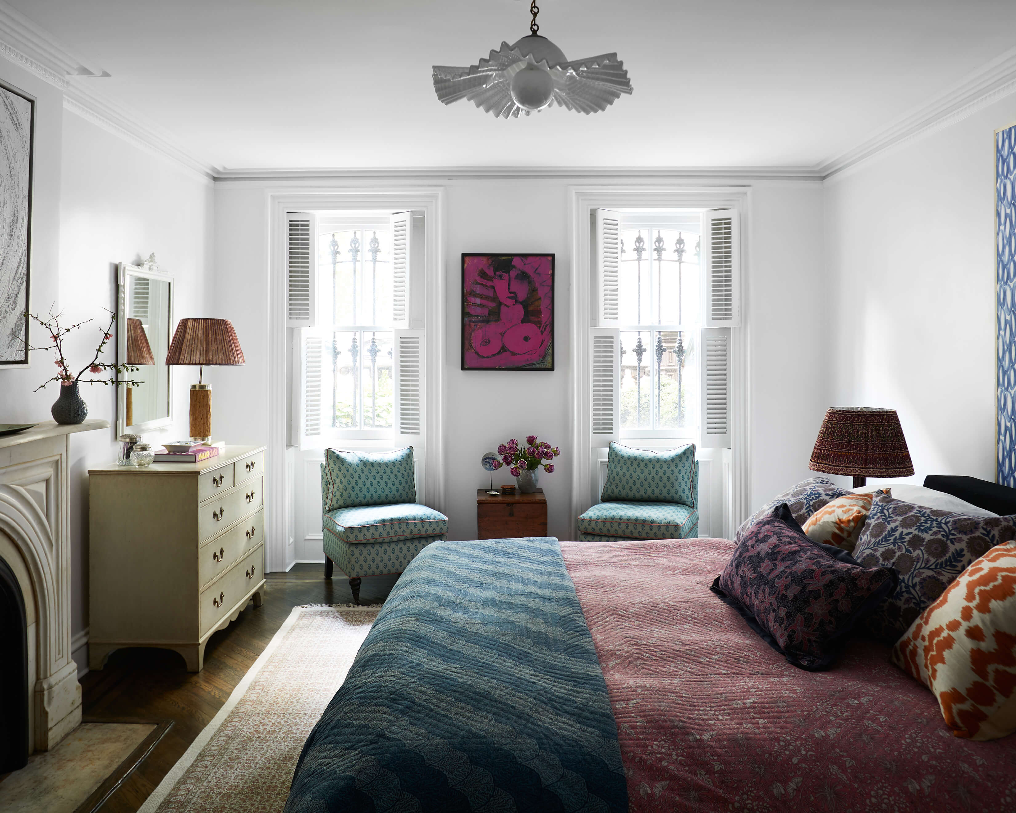
Nielsen brought deep color — indigo, teal and orange — into the garden-level bedroom with fabric and art. The slipper chairs, originally from One Kings Lane, were reupholstered in Indian batik.
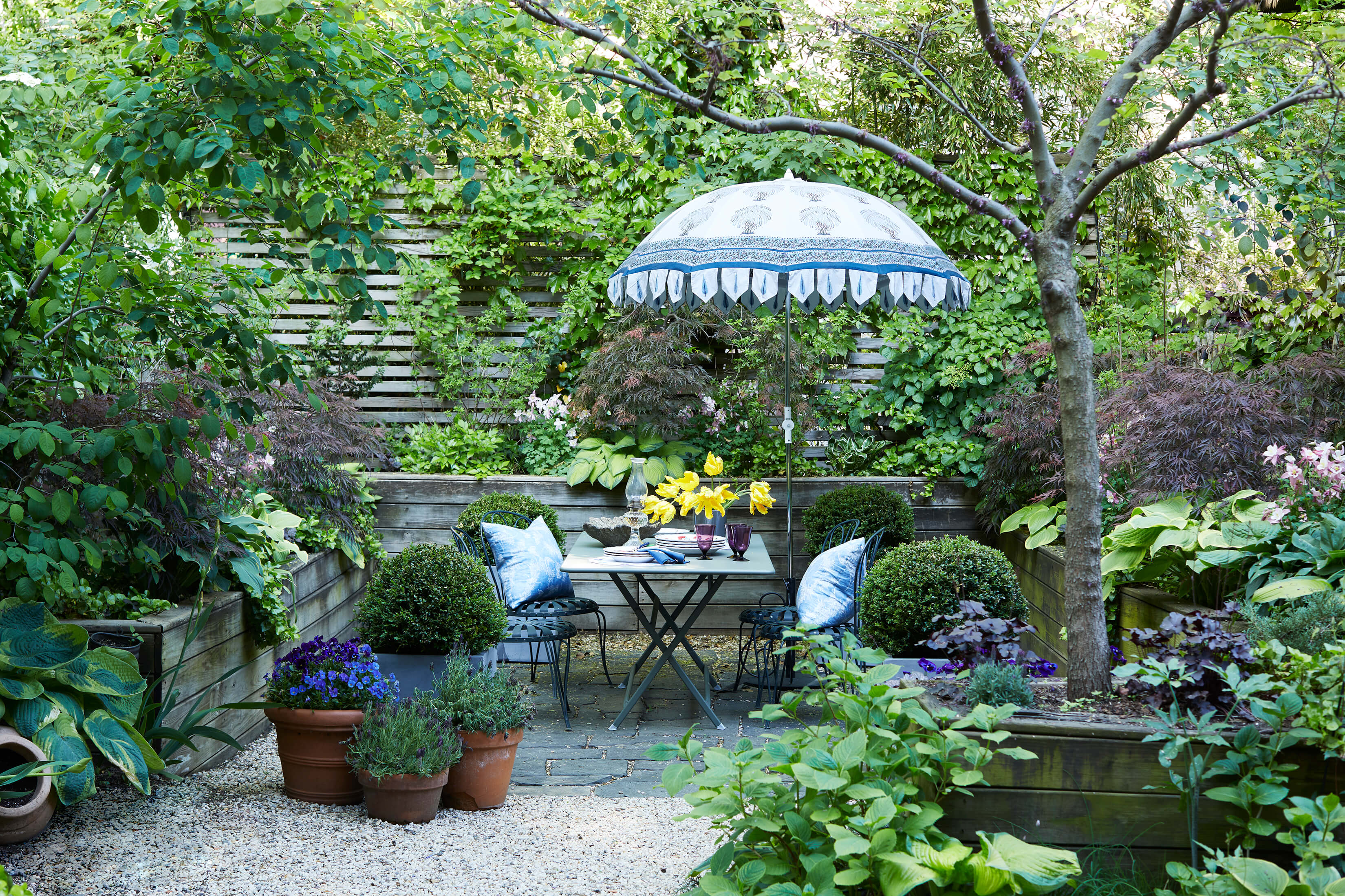
Even the garden, with its gravel surface and tiers of raised wooden planting beds, was charming and almost ready to go. Nielsen added wrought iron furniture and an umbrella, along with containers of boxwoods, herbs and flowers for an “English meets French” vibe.
[Photos by Manuel Rodriguez; Styling by Benjamin Reynaert]
The Insider is Brownstoner’s weekly in-depth look at a noteworthy interior design/renovation project, by design journalist Cara Greenberg. Find it here every Thursday morning.
Related Stories
The Insider Archive: Brownstoner’s In-Depth Look at Interior Design and Renovation Projects of Note
The Insider: Boerum Hill Townhouse Refresh Evokes an Arty Era with Deep Color
The Insider: Fort Green Family Unveils Townhouse Reno with Chic Global Decor
Got a project to propose for The Insider? Please contact Cara at caramia447 [at] gmail [dot] com
Email tips@brownstoner.com with further comments, questions or tips. Follow Brownstoner on Twitter and Instagram, and like us on Facebook.
"lively" - Google News
May 26, 2022 at 09:00PM
https://ift.tt/KBX5Mf7
The Insider: Emerging Designer Brings Lively Layered English Style to Clinton Hill Duplex Rental - Brownstoner
"lively" - Google News
https://ift.tt/mhdQ1qW
Bagikan Berita Ini


0 Response to "The Insider: Emerging Designer Brings Lively Layered English Style to Clinton Hill Duplex Rental - Brownstoner"
Post a Comment